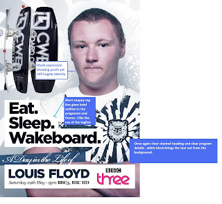
Little Text , text which is there gives brief outline of theme. Good use of imagery ad colour to grab audience .
Same target audience as my documentary therefore very useful source to see
how institution target the audience.
Lots of colourful graphics and strong colours such as pink.
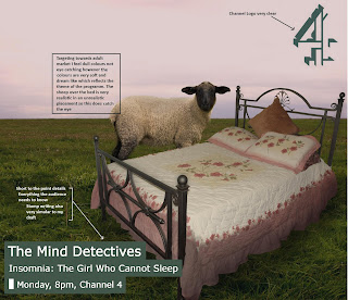
 Channel 4 documentary ad -Newspaper - 1/2 page
 Targeting towards adults older viewers than mine, Therefore less bright colours and uses techniques to attract audience for example the sheep above the bed in compassion to the Bright colours and graphics of the BBC 3 ad

Analysis adverts which I have sourced from newspapers will help me to make my advert conform to the normal advertised for documentary adverts while also showing me areas which advertises have used to work against conventions, for example the first advert shows how the advert conforms with giving the audience blunt information on the programme while it doesn't conform with using detailed graphics and tag lines. I shall seek to use these in my documentary as I feel these really make the reader want to see the documentary and offer a taste of the documentary
No comments:
Post a Comment